WHAT WE DID
Naming
Brand Strategy
Visual Identity
Brand World
Packaging Design
Artwork & Production
The Brief
Hilltop Honey wanted to expand beyond honey and enter the peanut butter category with a brand capable of competing against established players on Amazon and beyond. The challenge was to create a distinctive new brand with its own personality and presence. The opportunity was to break away from a category dominated by safe, predictable cues and create a brand with genuine standout, character and shelf appeal.
The Solution
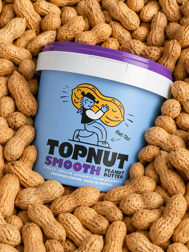
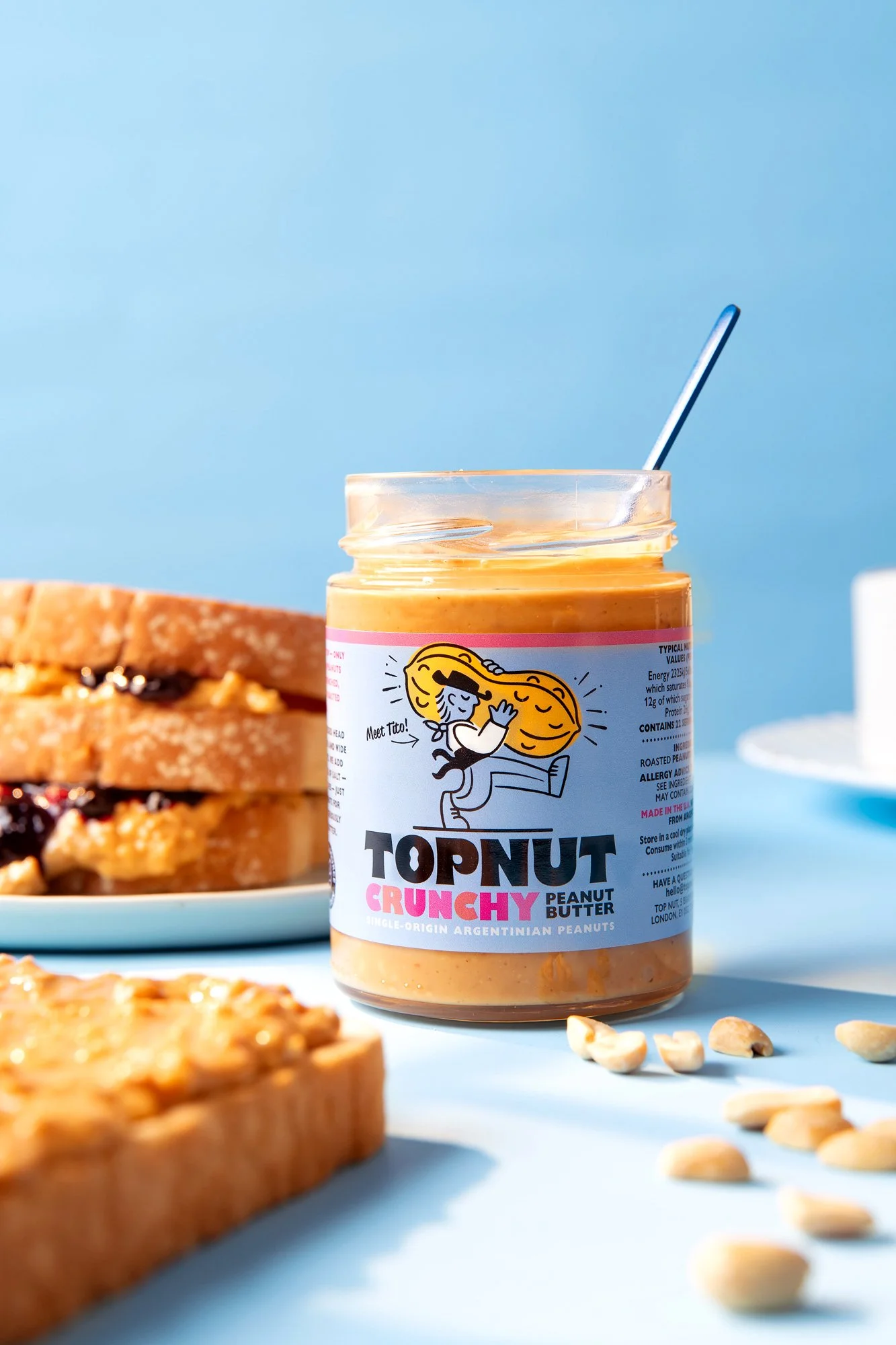
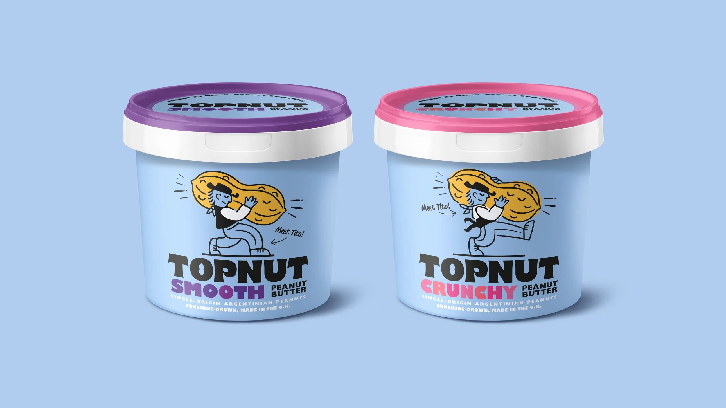
We created a bold, playful brand designed to bring energy and personality to the peanut butter aisle. From naming and strategy through to visual identity, every element was crafted to build a distinctive brand world that feels both premium and approachable. Central to the concept is Tito, a character-led brand asset that injects warmth, storytelling and memorability across every touchpoint. The result is a vibrant challenger brand that cuts through a crowded category, offering a fresh, characterful alternative to established competitors.
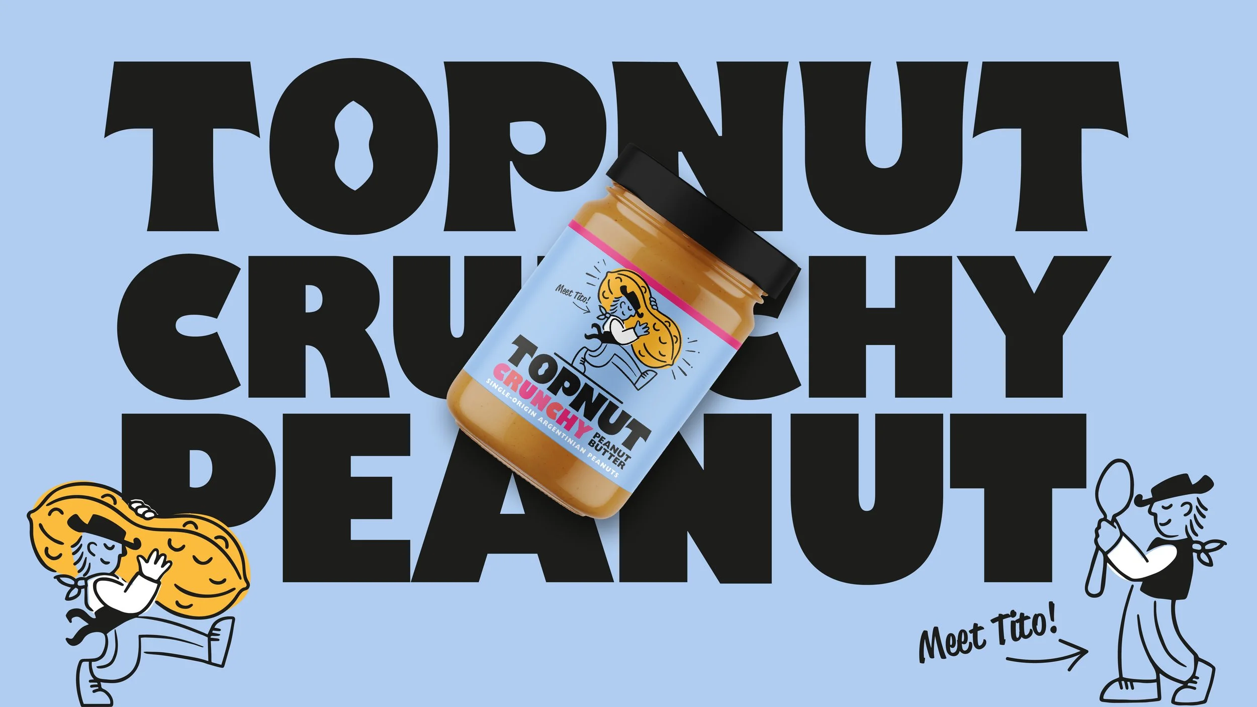
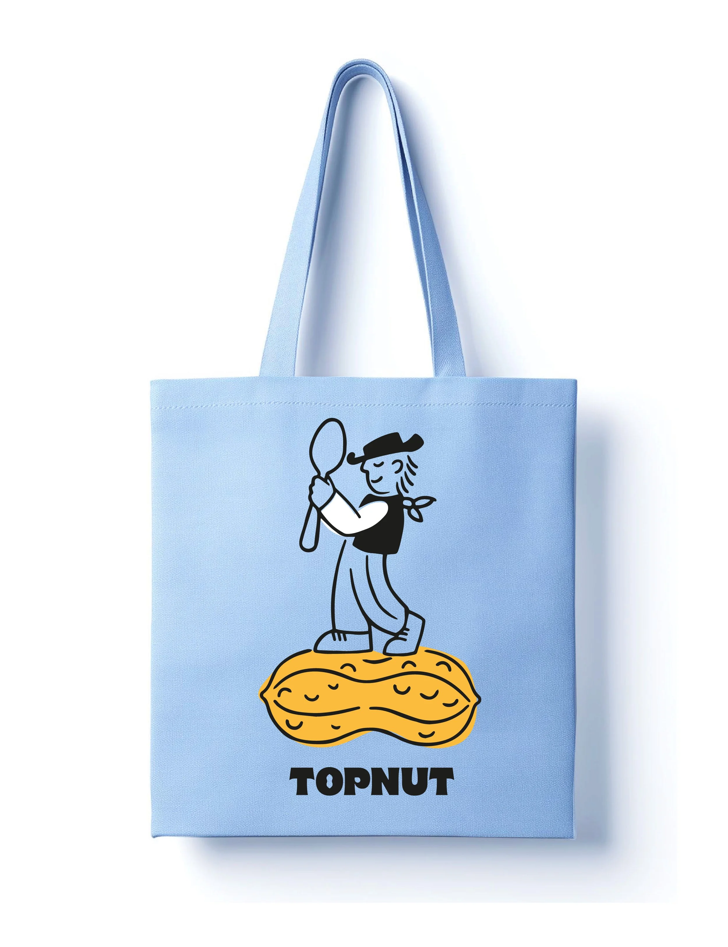
Tito, a characterful mascot inspired by the pursuit of the finest Argentinian peanuts. Through charming storytelling and playful copywriting, his adventures bring the brand's quality, provenance and personality to life.
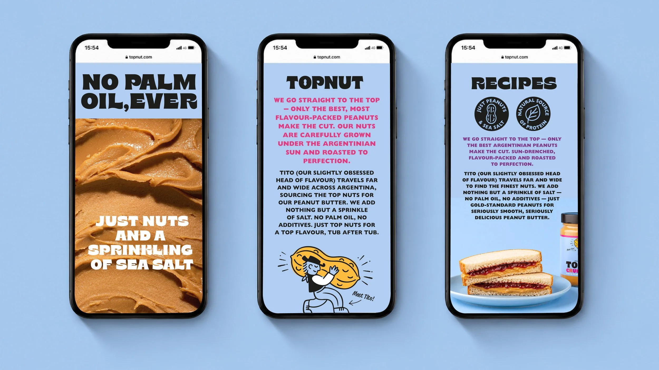
Creating an Ownable Brand Asset
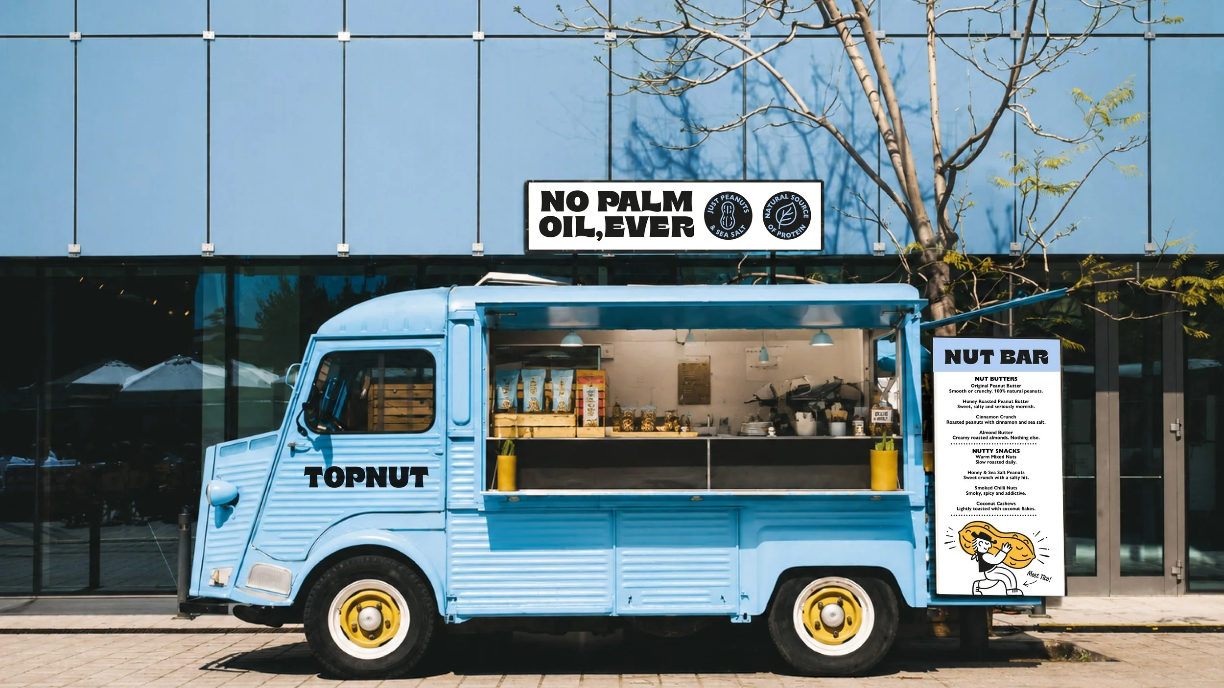
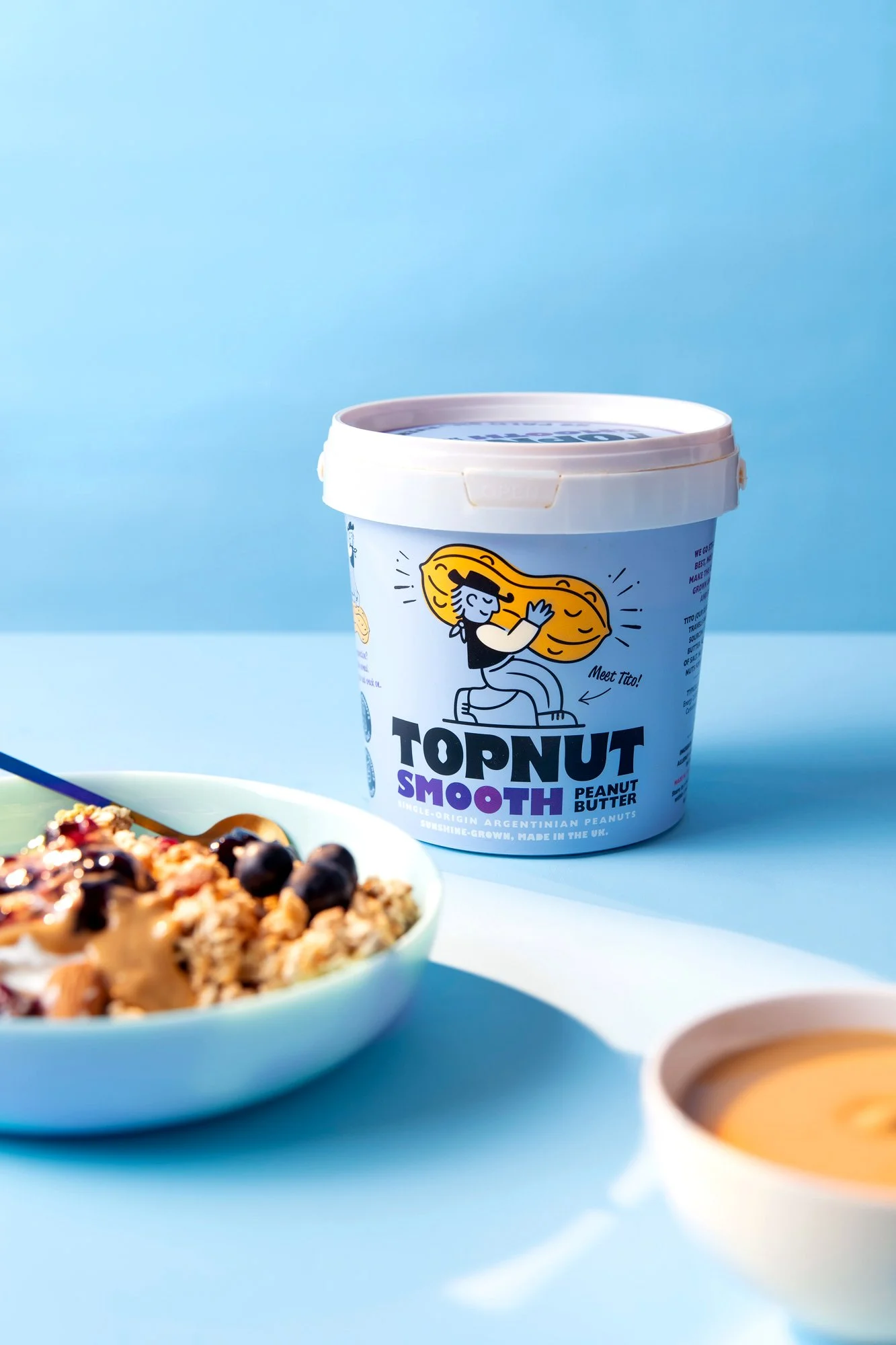
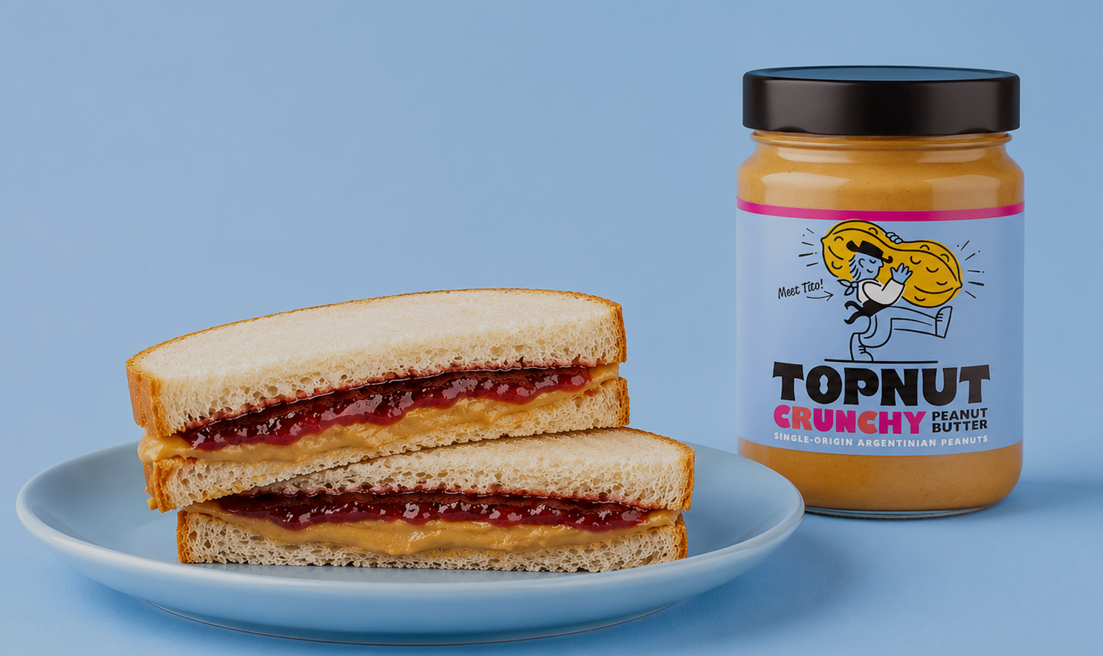
TopNut was designed as more than just a peanut butter brand — it was built as a distinctive brand world. From Tito, the oversized peanut icon, bold typography and disruptive powder-blue palette, every element was crafted to maximise memorability and shelf impact.
Simple ingredient-led messaging reinforces the brand’s quality credentials, while the playful personality creates an approachable alternative to the serious, often beige world of peanut butter.