WHAT WE DID
Brand Strategy
Range/Portfolio Architecture
Visual Identity
Packaging Design
Artwork & Production
The Brief
Hilltop Honey had grown rapidly, with an expanding portfolio that lacked consistency and clear shelf navigation. The challenge was to rationalise the range into a cohesive brand system that strengthened the masterbrand, improved variant recognition and created room for future innovation, all while retaining the brand's strong equity and personality.
The Solution
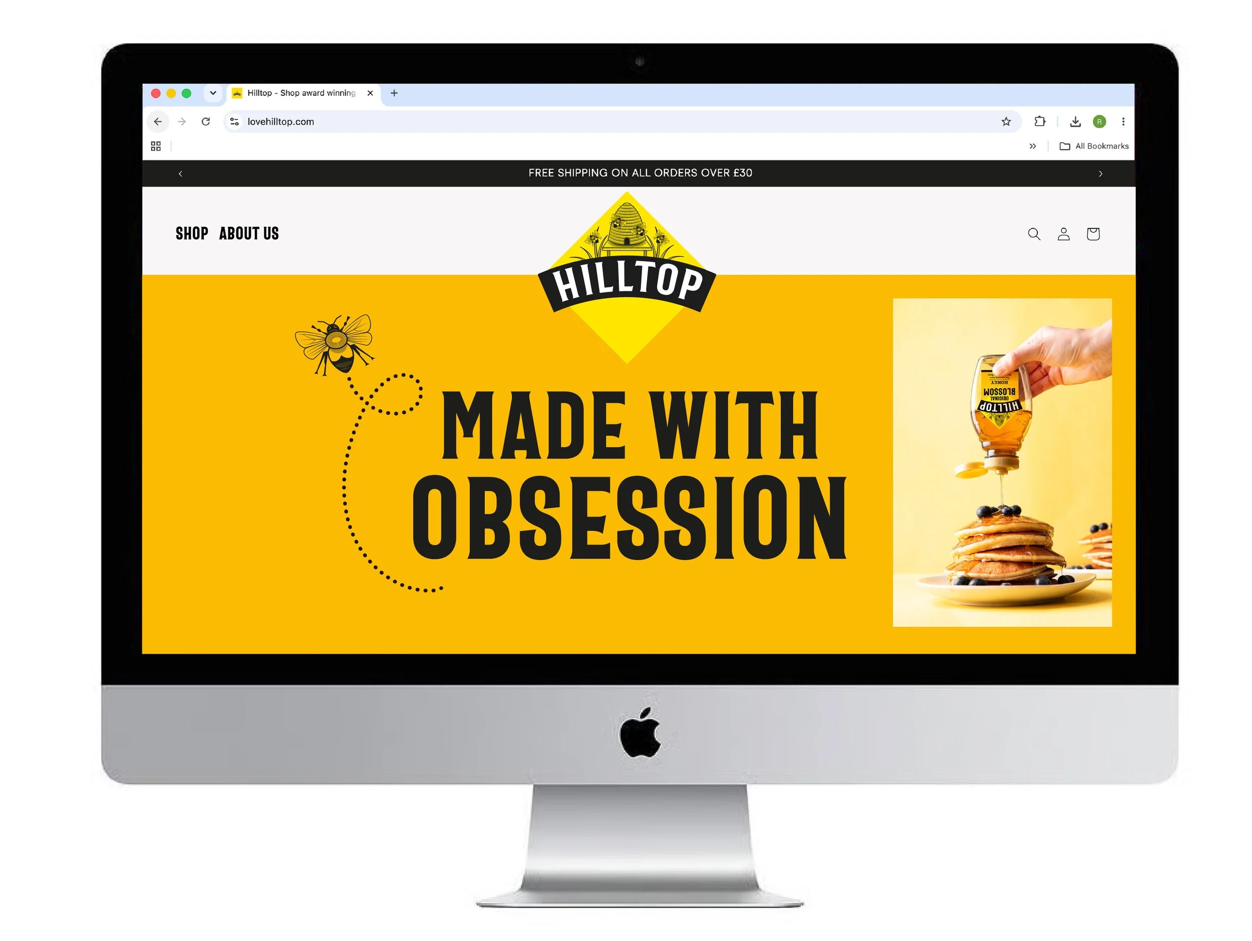
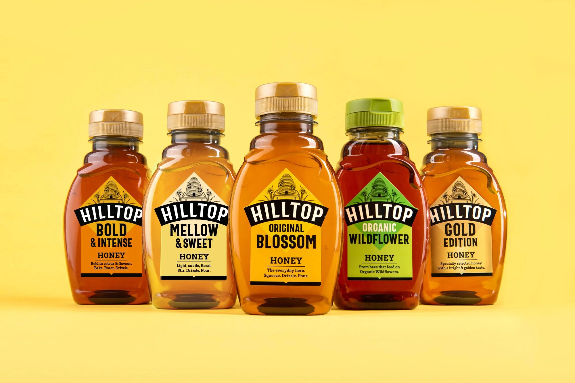
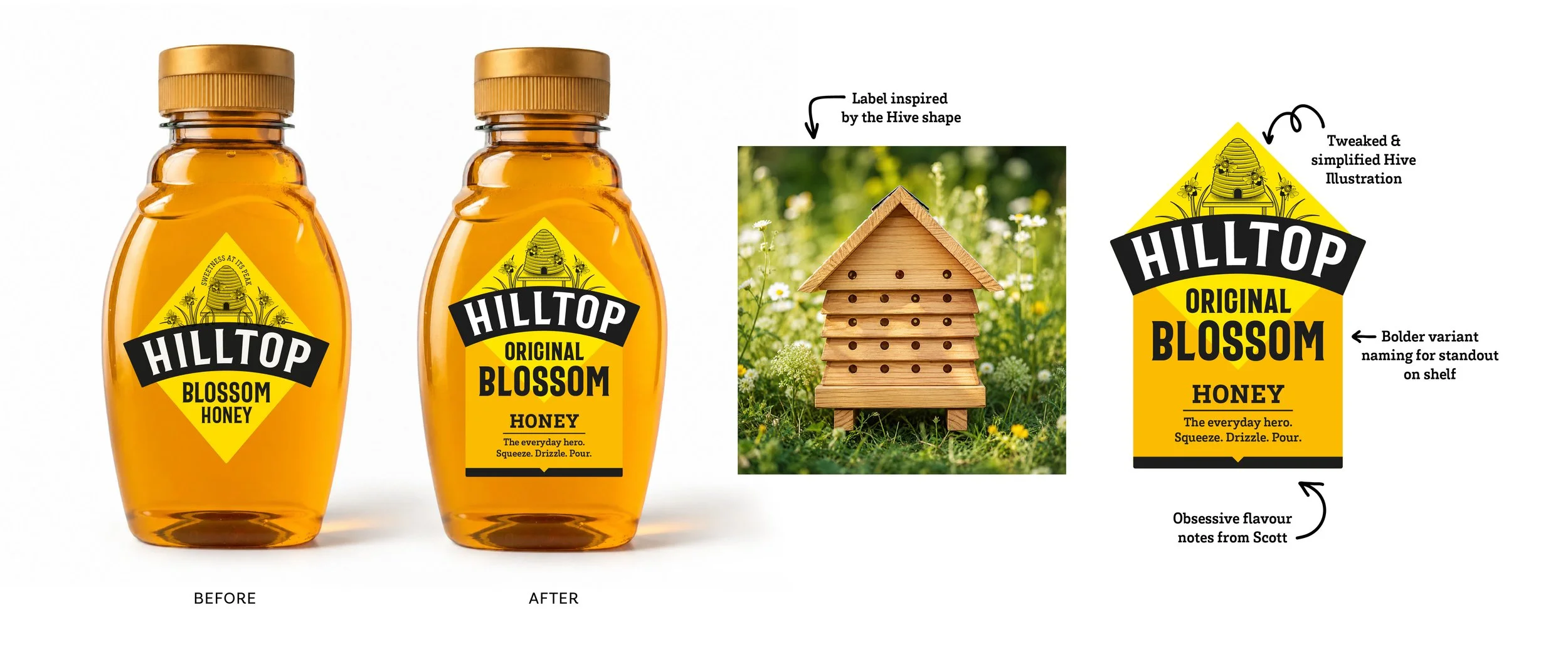
We evolved the Hilltop identity into a flexible brand system designed to work across every product category. By simplifying the masterbrand and introducing the Visual Hive asset, we created a more ownable architecture that gives greater prominence to flavour, provenance and product benefits. The result is a clearer, easier-to-shop portfolio with stronger shelf standout and a design system built to grow with the brand.
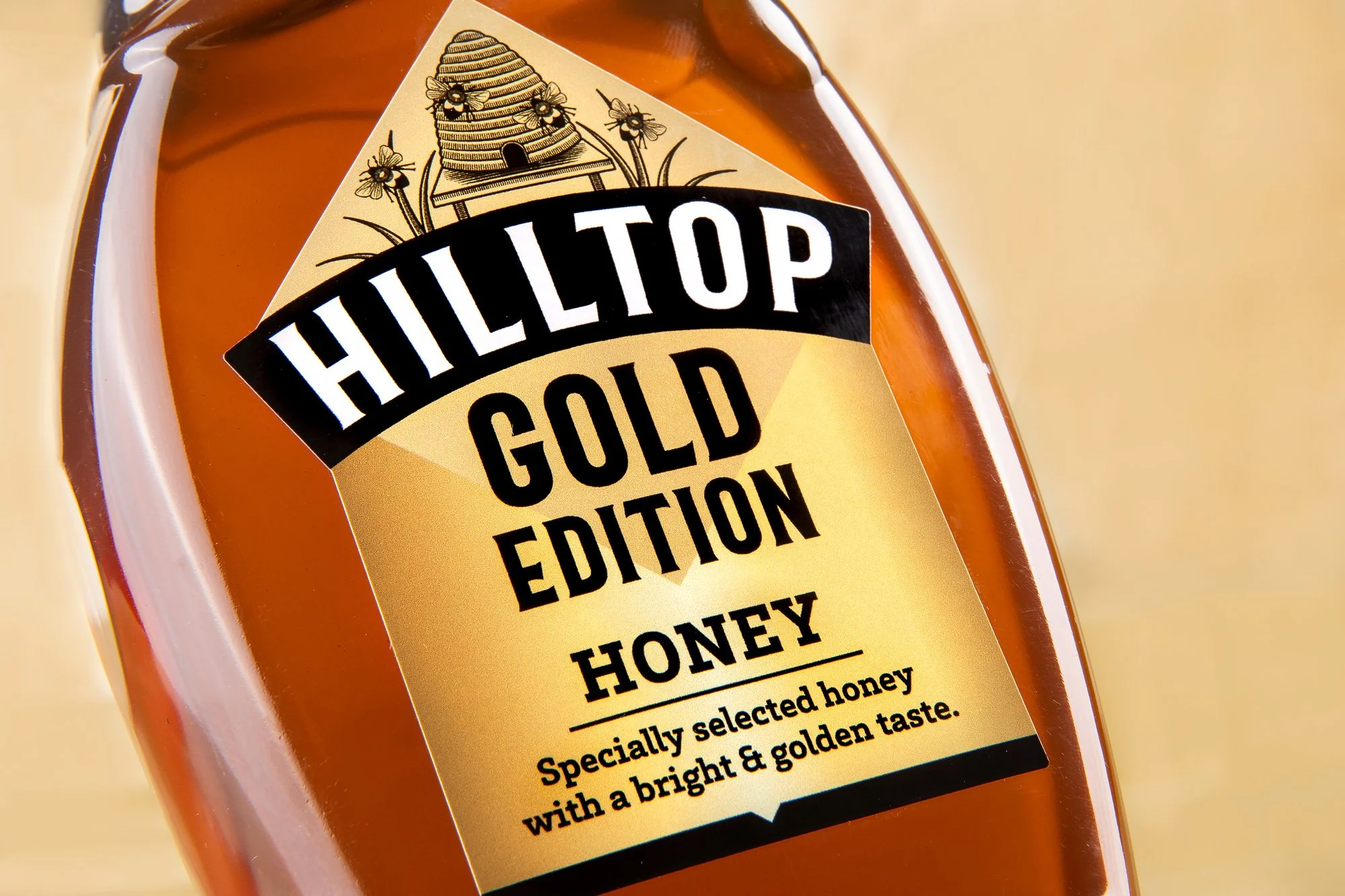
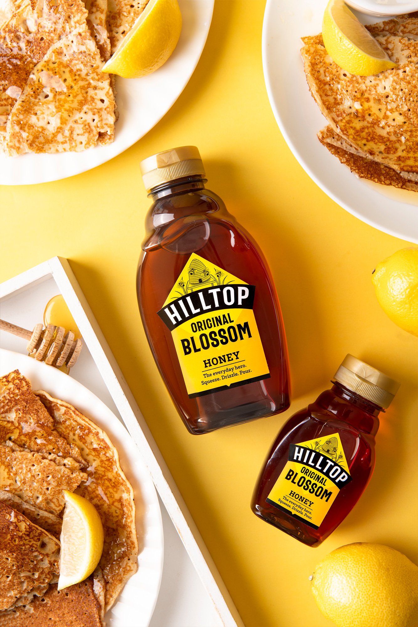
The Visual Hive became the foundation of the entire portfolio. Inspired by the natural structure of a beehive, it transforms the logo into an ownable brand asset while creating valuable space for clearer variant communication. A drop-down banner gives each product greater impact on shelf, allowing flavour, provenance and Scott's passion for honey to take centre stage.
Creating an Ownable Brand System
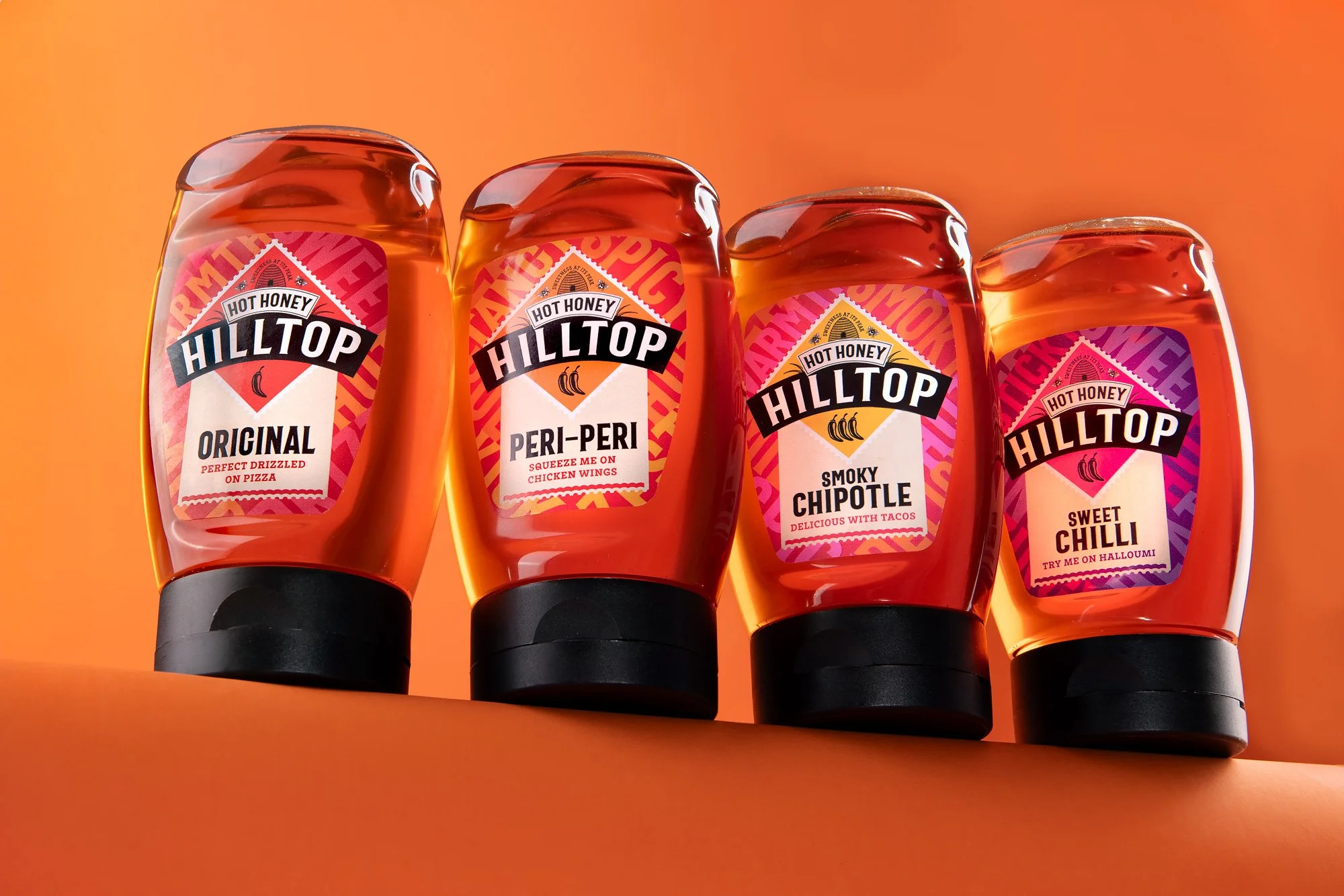
The project focused on creating a scalable design system that could flex across a growing portfolio. From the Core range and Origins to Manuka, Hot Honeys and future innovations, every element was designed to work together as one cohesive family.
Clear hierarchy, stronger variant navigation and consistent use of the Visual Hive create a recognisable masterbrand while allowing each range to express its own personality. Bright, optimistic colour palettes unify the portfolio while helping shoppers navigate the range with ease. The result is a portfolio that's easier to shop, easier to extend and unmistakably Hilltop.